Questions over the pronunciation of “gif” make it hard to work a gif-related pun into this heading.
Anyway I’ve got some more gifs and some more ramblings about what we’re up to.
So we’re working on a new trailer, which we’ll use to try and launch our Greenlight campaign. I’m trying to cut it together, so I have loads of footage lying around to make gifs from 🙂
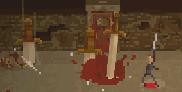
Here is an example of one of the magic types you can get with our randomly generated weapons- this is the “bloodstrike magic”. I’ve been tweeting lots of gifs, but this one got a lot more attention than any of the others, so I’m making a big note in my design book- “make shitloads more weapon magic!”
We’re getting a friend of ours “Old Shrimpeyes” to do voiceover for the trailer, and I can’t wait to get it out there and never have to look at that crappy old one again!
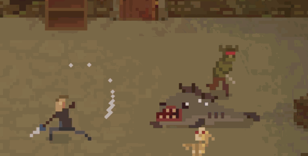
Also- slings!
Slings are awesome… and spears! So often underrepresented in dungeon crawlers, I’m making sure to give them some good action in Crawl! Dark Souls actually had some pretty sweet spear action as I recall, in fact I think Dave happily took a significant drop in damage to use the spear just because he really liked the feel of it- here is our sling:
Sorry about the slightly crappy gif quality- this one I captured from our video editing software instead of straight from the game and it came out a little crummy!
I really want to do a flail some time too…
And a battleaxe…
 tweet
tweet
 share
share


I like it that our hero can now-*SWORDS FROM CEILIIINNNGGGGGGG*
You guys just keep adding to the awesomeness.
Can you please give a pixel art palette tutorial or just a brief description? Do you generate swatches first or kind of pick any colour? You colour choices are very consistent and create a pleasant warm and realistic picture. Thank you.
hey Den! Colour palette is definitely something i have struggled with on this project- I made a lot of monsters and effects in isolation without checking them against the colors of the scene they would occur in (because I hadn’t done any enviro art yet), so when i put it all together it was ugly and clashing!
Over time I have been trying to fix the probelm, and have been slowly pushing towards a more consistent “murky dungeon lit by warm lantern” vibe. I think a lot of my monsters/effects are still clashing a bit, but it has come a long way form the original and looks much better and more coherent
When I get time, I’d be happy to put together a detailed post explaining my process and the ways I’ve gone about it…
Big influence for me is my memories of Quake 1 and Diablo 1- i really like the murky orange color palette in Quake with dirty green tones, and I love the stark harshness of the Dialbo color scheme- it’s sometimes a bit ugly, but feels so unforgiving and gothic compared to the bright fairytale colors of something like WOW or Torchlight (lovel looking games, just not what I’m going for with Crawl)
I think you guys are pretty awesome to share your workflow… This is a big inspiration and makes your technique seem approachable.
I am not a fan of cartoony mass-audience art myself. I dig Crawl, Teleglitch, Confederate Express, Paradise Lost, Hyperlife Drifter reallistic low-res style.
My current plan for colour scheme is something like this (involves coding):
1) pick preferred hues – could be as simple as primaries down to tertiaries probably
2) generate 3-5 shades and 3-5 tints for each hueue
3) produce a Photoshop swatch file
4) use the generated colours to produce sprites
5) apply noise as an overlay layer to make e.g. worn metals look more reallistic. Could be an animated in-game overlay as well – I noticed you have some sort of latern-like pulsing light in your action gifs
…so that’s engineers approach to art and creativity!
Hey Den, I’ve been busy with the trailer and completely neglecting the blog for the last few weeks!
Firstly, Teleglitch is awesome- those visuals have so much Quake atmosphere, and the whole thing has such a strong mood achieved with such minimal visuals, I am very impressed by that game… and when I first survived from the start to level five it was such a thrilling and terrifying experience!
Your approach to palette looks good- logical and effective! My approach is generally more messy and I should probably adopt a process where I use custom swatches- i just bring in another character and/or a little chunk of the environment into my file and use them like a little palette, just using the color picker (eyedropper or whatever its called) to pick colors form them. I Color most of a new monster with shades picked/mixed form them, but I’m always willing to add a small touch of something brighter from outside the palette as long as it isn’t over a large area.
The game isn’t pure low resolution….uhh im actually only noticing this now..i guess it would take a longer time to achieve what you want in pure low res..
yep, the art is super low but we take full advantage of modern screen resolution for smoother movement etc- so you can move much more finely than 1 pixel increments as each pixel is pretty big. it also helps with rotating low res sprites without them getting “garbled” like would happen at native low res, but obviously you end up with shapes off the natural pixel grid
yea cause i was looking at those swords crashing down on your enemies, they’re at an angle. Whilst making my game i told my friend (he’s the coder) to make sure the game is pure low res (256×144) but then again pixel art is a style rather than a limitation. Cool thanks man.
yep, there are a handful of functional advantages using full res, but you really have to be very careful or it can easily look jumbled and ugly- pure low res is always going to look a little tighter and cleaner
there are a lot of little things i’ll have to do like snapping particle objects to pixel grid etc to stop them looking really messy that you won’t have to worry about going native 256×144 🙂
Sorry my this is my last comment i know you guys are in a shit storm right now :P. I’m pretty sure i read somewhere in your comments that your colour palette is a ‘messy’ one. You just picked randomly? I had a set palette but i ran into problems because my characters were like blending into the background. It’d be easy if i had all outdoor scenes but the game is mainly focussed on temples. I recently created a base 16 colour palette and just added more as i go on creating the sprites. i know i should use pale colours for my background and sharp darker colours for my characters and foreground but detail gets lost easily in pale colours. I want the temple interiors to be detailed do you have any advice on how to do this??
i don’t have any simple rule for making things stand out against the background, but it is very important- personally i just go by eye these days and make sure all outer detail (edge detail) on a monster is significantly lighter or darker than the floor around it. i also have to make sure it reads clearly against the back wall- this is where it gets a little tricky as the wall is darker and will read against different values.
some people like to have a “desaturate” layer over the top of everything they can switch on and off to see their work in grey-scale… looking in grey-scale makes it very obvious whether colors in a character are significantly darker/lighter than the background they’re up against
my biggest advice would be to never paint/design a monster or prop in an empty “sterile” scene with nothing else in there- always be drawing in a scene that shows the in-game background- that way you will naturally notice if it doesn’t read properly
when i started the game i made a lot of props and monsters in their own scenes on white backgrounds and that is still coming back to haunt me today, and i will have to do a big pass some day soon on editing colors to fix problems caused by this
as always thanks dude!!