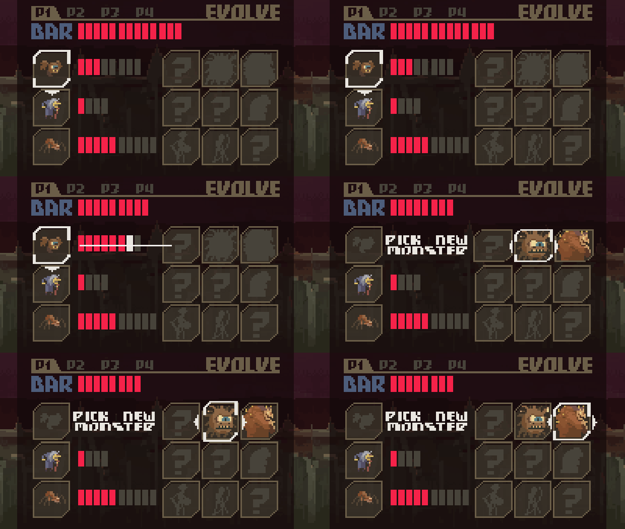
Damn you Zeus, mighty god of menus!
This is a mockup I did for the monster evolution/upgrade screen… except now I’m trying to fit all that into one screen four times over, without it being confusing or looking crappy… 🙁
I tried for a while, got angry then ate an ice-cream… now back to it!


 tweet
tweet
 share
share


Woah! That looks really cool. Maybe if the person controlling the character had a bigger menu, and the rest had a smaller, less detailed version?
thanks for the suggestion- definitely worth thinking about… the biggest barrier is really the low resolution putting a hard limit on how small elements can become while still retaining enough detail to communicate what it is
stay tuned for more- I’ll be curious to see what people think of the redesign 🙂
Lookin’ good!